De Correspondent
As an information designer, I support our journalistic articles with data visualizations and infographics. These are a few examples to illustrate the scope and variety of my work.
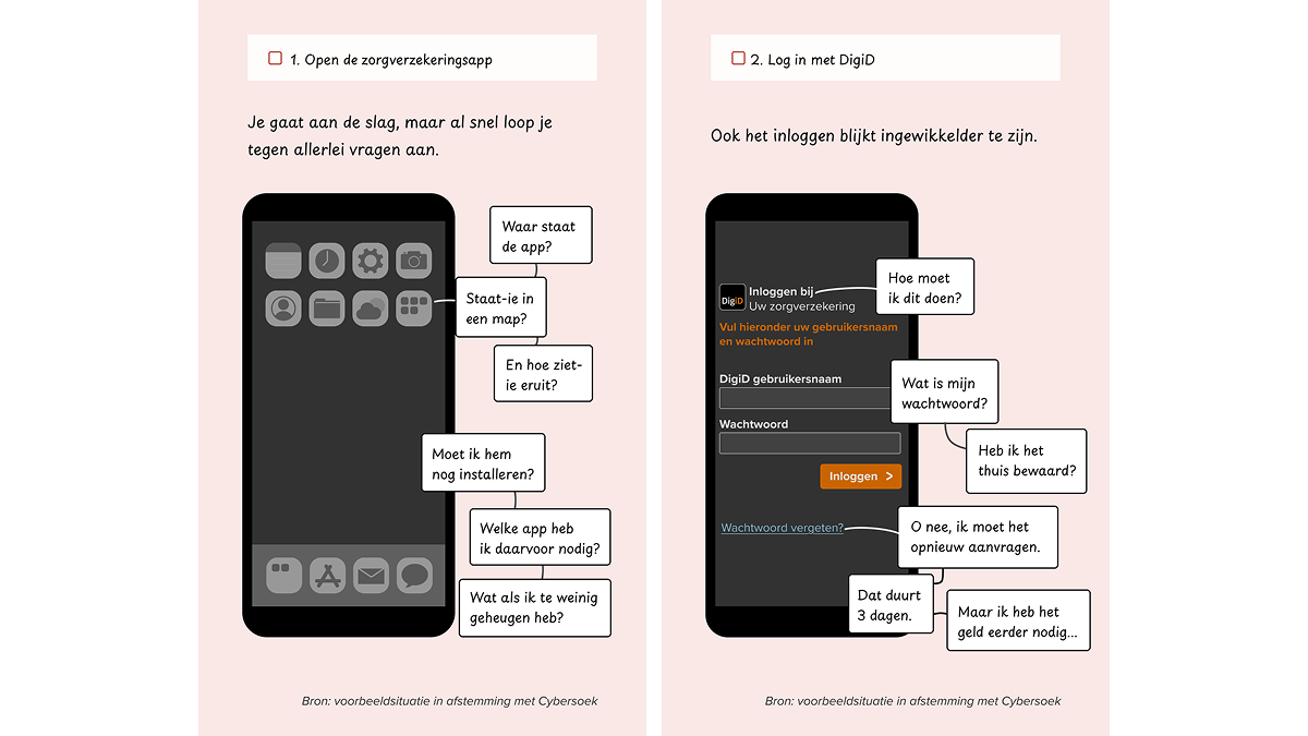
Digital illiteracy
What does it feel like for someone who is digitally illiterate to use apps? This infographic guides you step by step alongside them, helping you understand their experience.
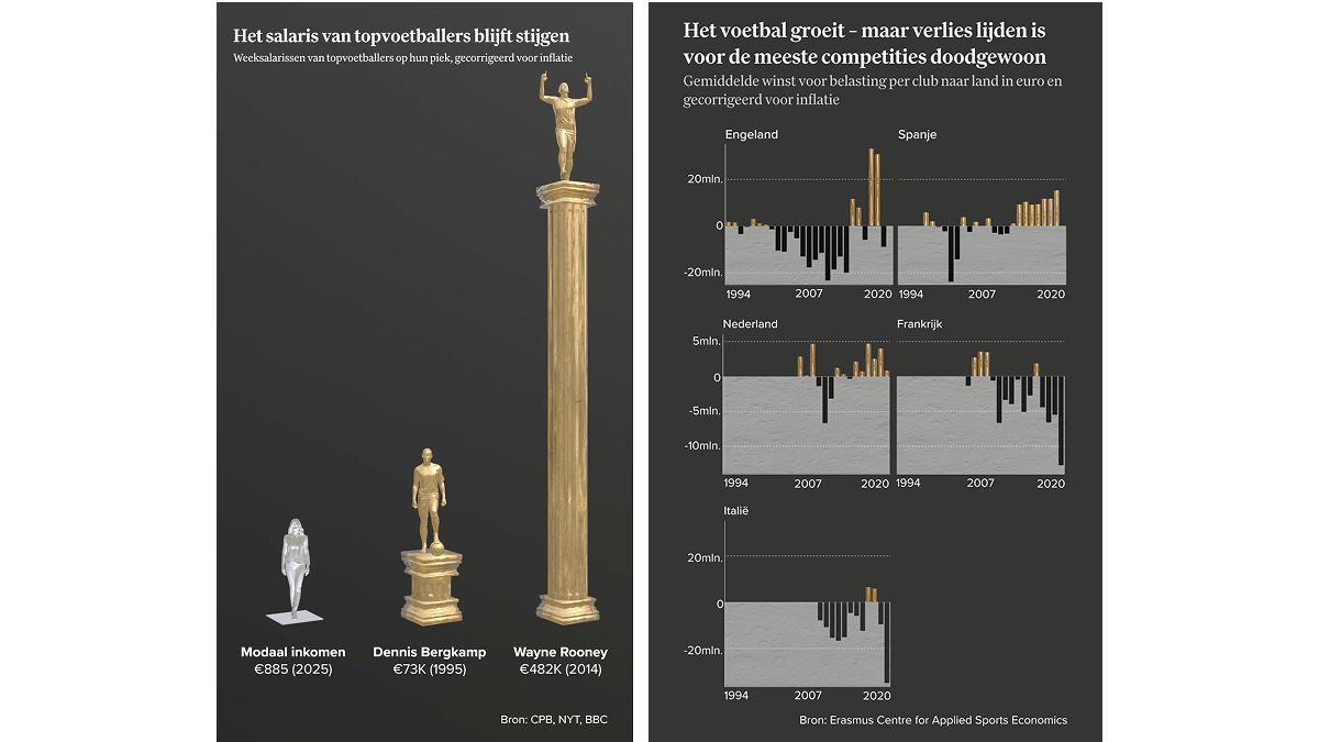
Salary of professional football players
This visualisation shows the dramatic rise in players’ salaries in recent decades. I created this visualisation using Blender and animated it to highlight the immense growth in salaries.
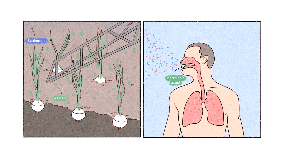
Fungal Resistance
A recent health concern is the increasing resistance to antifungal medications used to treat fungal diseases. This infographic illustrates how this resistance is spreading among the population. This project was a collaboration with illustrator Lucas Burtin.
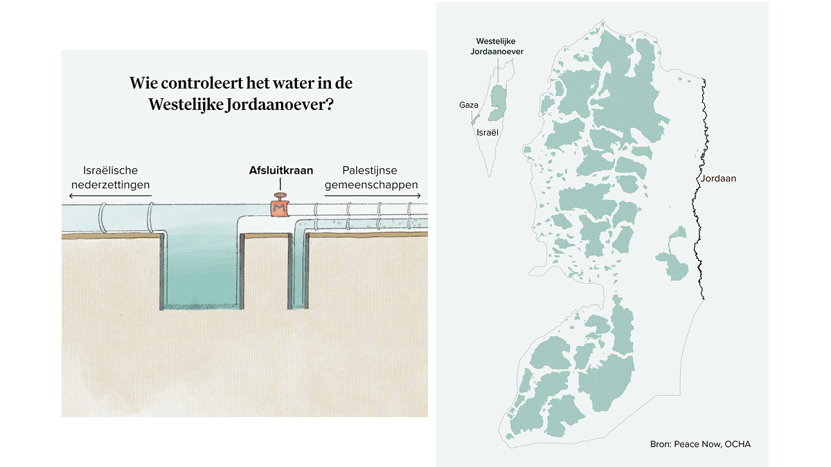
Water scarcity in the West Bank
This story examines how Israel is using control over water access as a means to oppress the Palestinian population in the West Bank. I developed a visualisation to reveal the strategies behind this, along with a map illustrating how little control Palestinians have over large areas and how this impacts access to water.